
The perfect solar marketing website: An ultimate Guide (+ Checklist)

We have audited over 100 websites of the largest and fastest growing solar companies in the U.S. and summarized the lessons learned below.
One of our biggest strength at Sunvoy is that our Co-Founders bring together years of experience and world class practice in not just solar, but as well sales, marketing and user experience.
And if you didn’t know it yet, our CTO has worked as a consultant for some of the biggest online businesses on how to build websites and apps that are not only beautiful, but more importantly work to accomplish the most important objective: generating more leads and sales.
Or in the language of online marketing: How to build websites that convert.
This is actually as much an art as it’s science.
There are a lot of strategies you can make use of that are little known outside the online marketing space or six figure consulting practices. You can’t necessarily count on your average local website agency or marketing agency to be aware of.
So without further ado we present you a complete checklist to build the ultimate marketing website for your solar business.
How many checkboxes did you miss?
The basics
Make it super fast instead of painfully slow
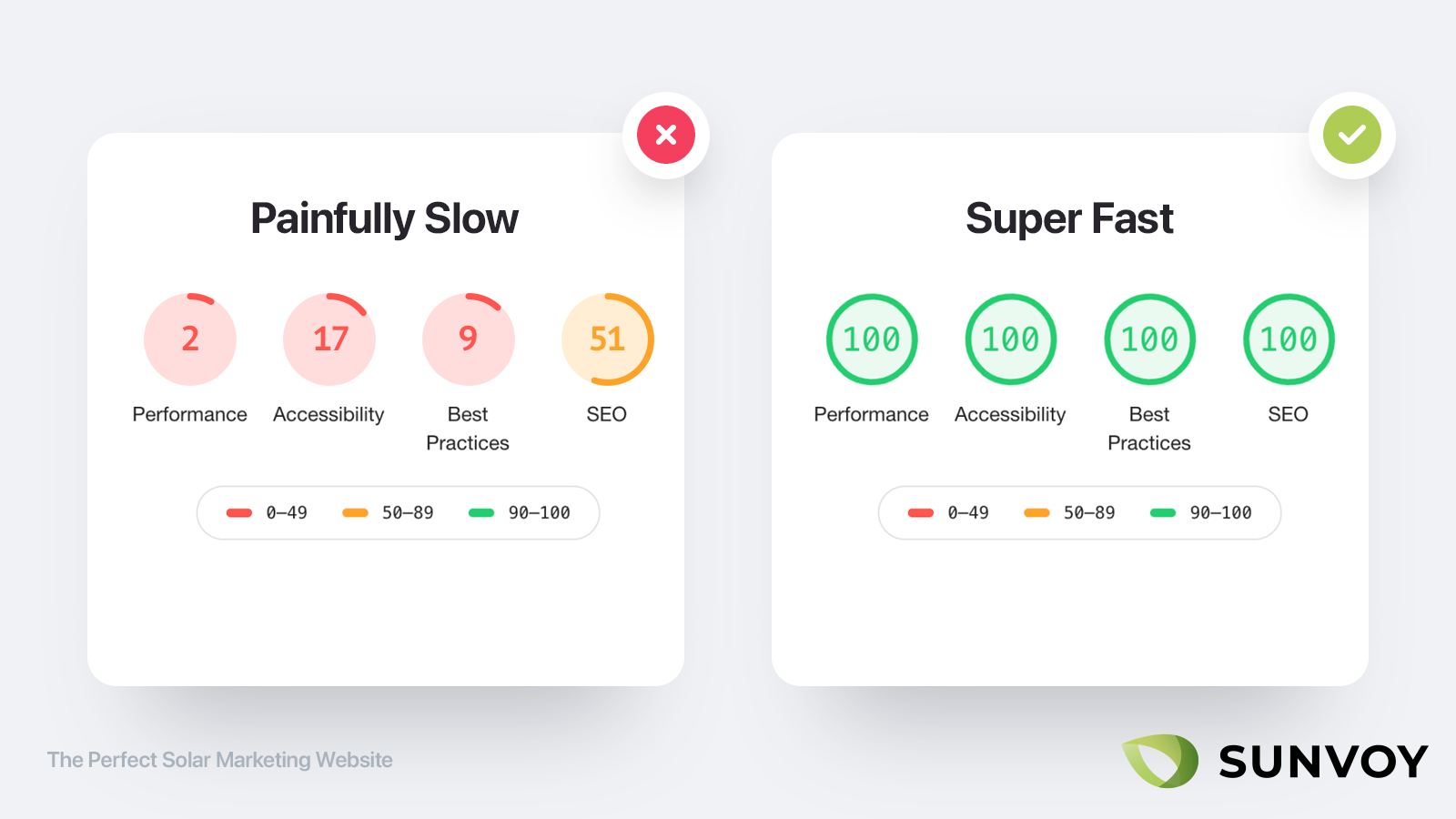
Your website should be loading blazing fast on any device. If you can only do one thing, than make sure it’s that.
Studies after studies after studies have shown that for every second your page requires loading, you cut your potential revenue in half.
This is especially true for targeting consumers. Used to the fast world of social media marketing consumers today are trained to open a link and obtaining results instantly. If your visitors have to wait for even a couple of seconds before your website is loaded, they will jump back to Google and try a different website instead.
A fast loading website doesn’t just help tremendously with conversions (e.g. turning one time visitors into leads and customers) but as well with Search Engine Optimization. It has been a ranking factor as long back as 2010, so improving website loading speed can have a massive impact on your Google rankings. It can give you as well an edge over your competitors and their bloated and cheap WordPress websites.
Use HTTPS instead of HTTP
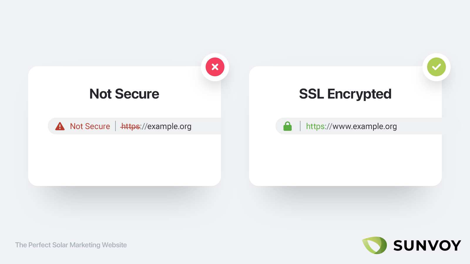
If your website is not using HTTPs by default yet, then that’s the very first thing you should be taking care of. While 80% of websites use HTTPS as the default protocol, you still find many websites that are accessible using an insecure connection instead of redirecting which nowadays is simply unacceptable.
Using HTTPS gives you the secure lock in the browsers and makes sure that customers can trust entering private information on your website.
And if you are already at it make sure as well that you either use the www. or non www-version of your domain and stick to it.
Using either one is fine, why using www. is recommended from a security perspective. What matters is that you choose one over the other and make sure to setup a 301 redirect and canonical tags to the version you choosed to prevent any potential SEO issues with duplicate content.
Remove things instead of adding
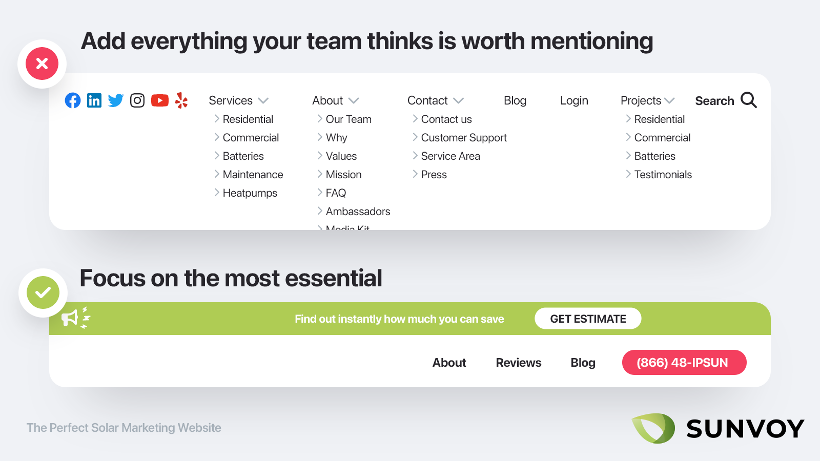
The problem with hiring most Webdesigners and Agencies is that incentives are often misaligned. The more pages you want the more they get paid. They also let the client drive the wheel, although the client might not necessary be the most experienced person to drive.
In my consulting practice I have always followed the principle that I know best based on years of experience and it’s my job to guide and educate the client to understand what’s best for him.
This doesn’t mean your input as the website owner is not important (in the end you are who best knows your market and customers), but it does mean that cutting down ruthlessly on what’s currently there is absolutely necessary.
Less is more.
The most common mistakes solar installers make with their website is that they try it to do everything at once. Instead of accomplishing just one or two very important objectives, they try to do everything which in the end fails to accomplish anything.
With a perfect website it’s like with a Michelin restaurant:
It’s not the number of items on the menu, but the quality of each item. Focus on only a small selection of things and make sure that you are the best in the world at it.
This is true on the macro level (e.g. the structure of your website) but as well in the individual level.
Remove words and sentences from your text and go straight to the point instead of rambling too long without saying much.
Use human language instead of corporate speak
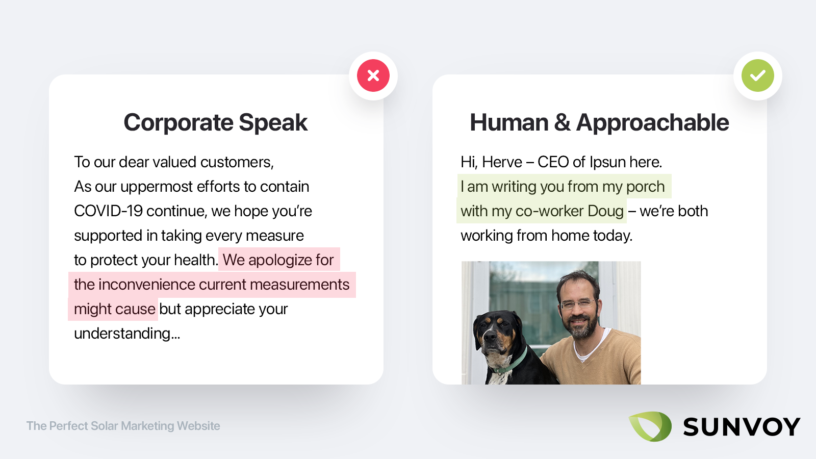
While most people talk in everyday language to each other, on our websites we often fall into the "corporate trap" where we use complex corporate speak such as "we apologize for the inconvenience" instead of everyday language.
Yet what resonates most deeply is the way you talk when you are with a group of friends:
Communicate clearly what you do and what makes you unique right on your front page.
Use the same language you would use if you were asked at a barbecue party. Don’t use fancy words or complicated sentences as if you were writing a highschool thesis. Checkout this page for more excellent and easy to implement copywriting tips.
Focus on the visitor instead of yourself
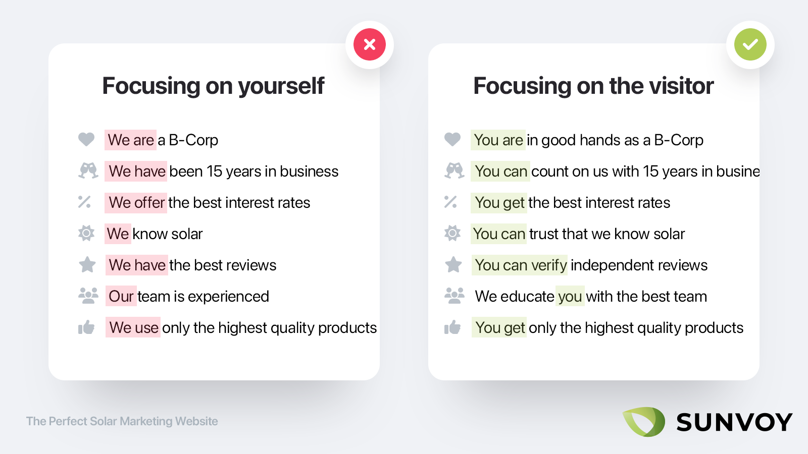
The worst website title ever is "Welcome to our website". It doesn’t tell me, as a visitor what this is about and why I should care.
You might think that’s an outdated example from the 90s but you won’t believe how many times I still read "Join our newsletter". Beside always using "we" and "our" there is not a single person on earth that wants to receive yet another newsletter.
This needs to be your guiding principle: Always answer the visitors question "What is in it for me?" or "why should I care about that?".
Use the word "you" as much as possible while trying to reduce the usage of the word "we" and "our" unless absolutely necessary to explain a benefit for the customer. If you re-read this post conciously you will notice that I am doing the same thing, which turns this from a lecture into a conversation.
Optimize for mobiles vs. desktops
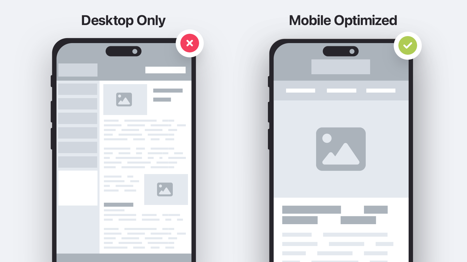
Even without taking a look at your Google analytics I can almost guarantee you that the majority (70%+) of your visitors will be coming from mobile.
This is true across the board, yet mobile website design usually still comes as an afterthought. Remember the last time your agency presented you with a new layout? I would bet it was the polished desktop view, while not telling you how it will look and work on mobiles.
You should make mobile a priority.
First ensure it looks great and accomplishes all of your most important objectives on a small screen, then work your way up the screen size.
Certain elements or extra information might be only visible on large screens, or certain buttons should be bigger and easier to access on mobiles.
This helps as well with the previous point of focusing on the most essential items first, as you have less screen real estate and need to focus on the items that truly matter.
Design
Choose a single main color & font
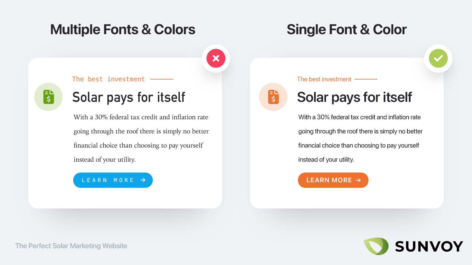
As we said above most people make the mistake in choosing too much at once.
If you want to be consistent with your branding focus on a single main color and a single font for everything. (That includes all of your marketing collatoral, not just your website)
Ideally you even use a system font so your visitors don’t need to wait until their browser downloads an additional font, which again helps tremendously with loading speeds.
Then you can repeat that same combination through the rest of your corporate identity, eg. Trucks, Uniforms, Print or even your own white label customer portal.
Choose a complementary call to action color
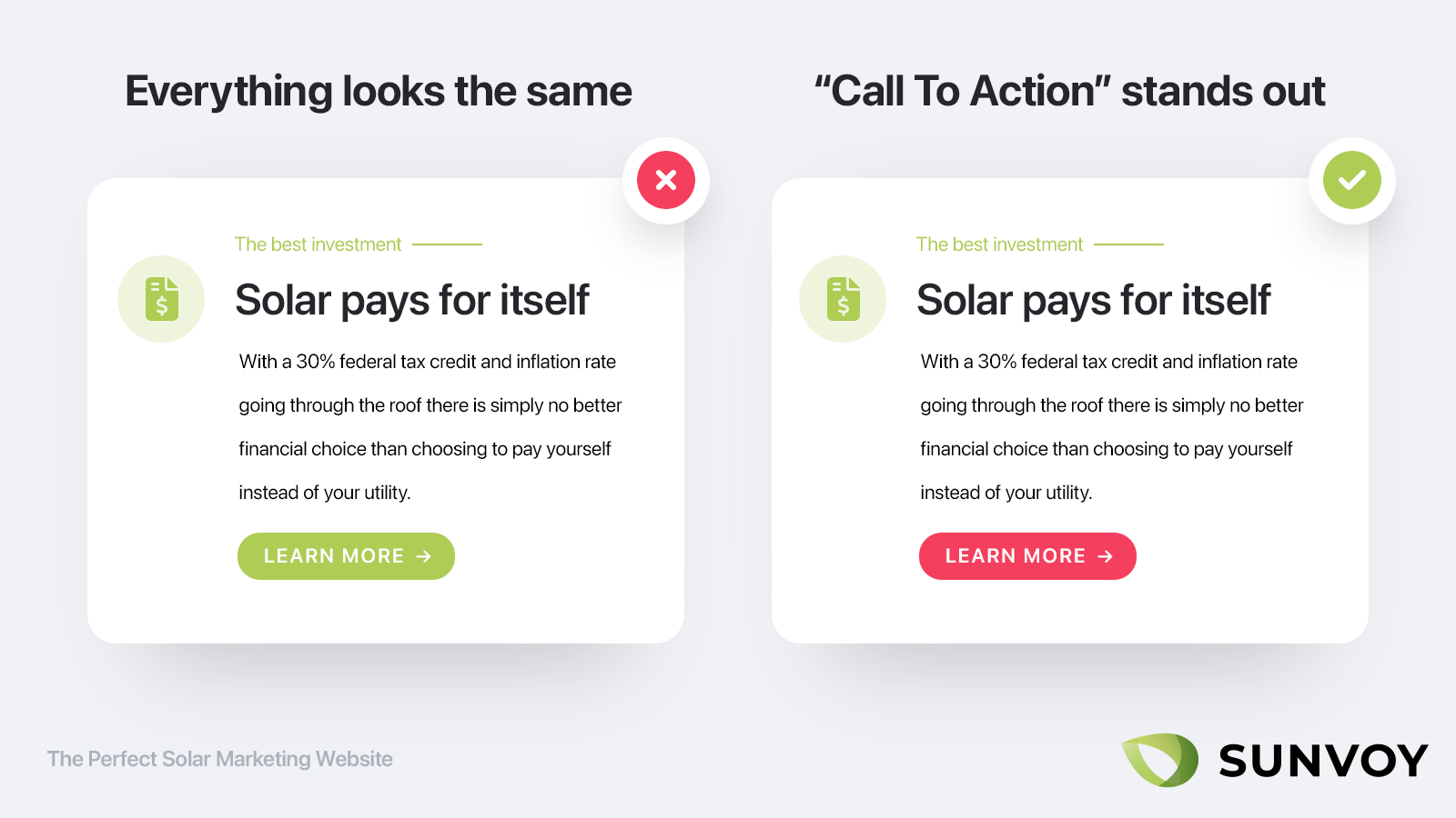
The only exception to the rule above is for your call to action buttons.
Your call to action buttons need to stand out immediately and should not get lost in the overall design.
The whole idea of call to actions button is that they are easy to spot (and hard to miss) and "call attention" to themselves.
Give them a color that has a high contrast to the rest of your page so that they are the first thing to draw the eye to.
You can simply choose the opposite color on the color wheel:
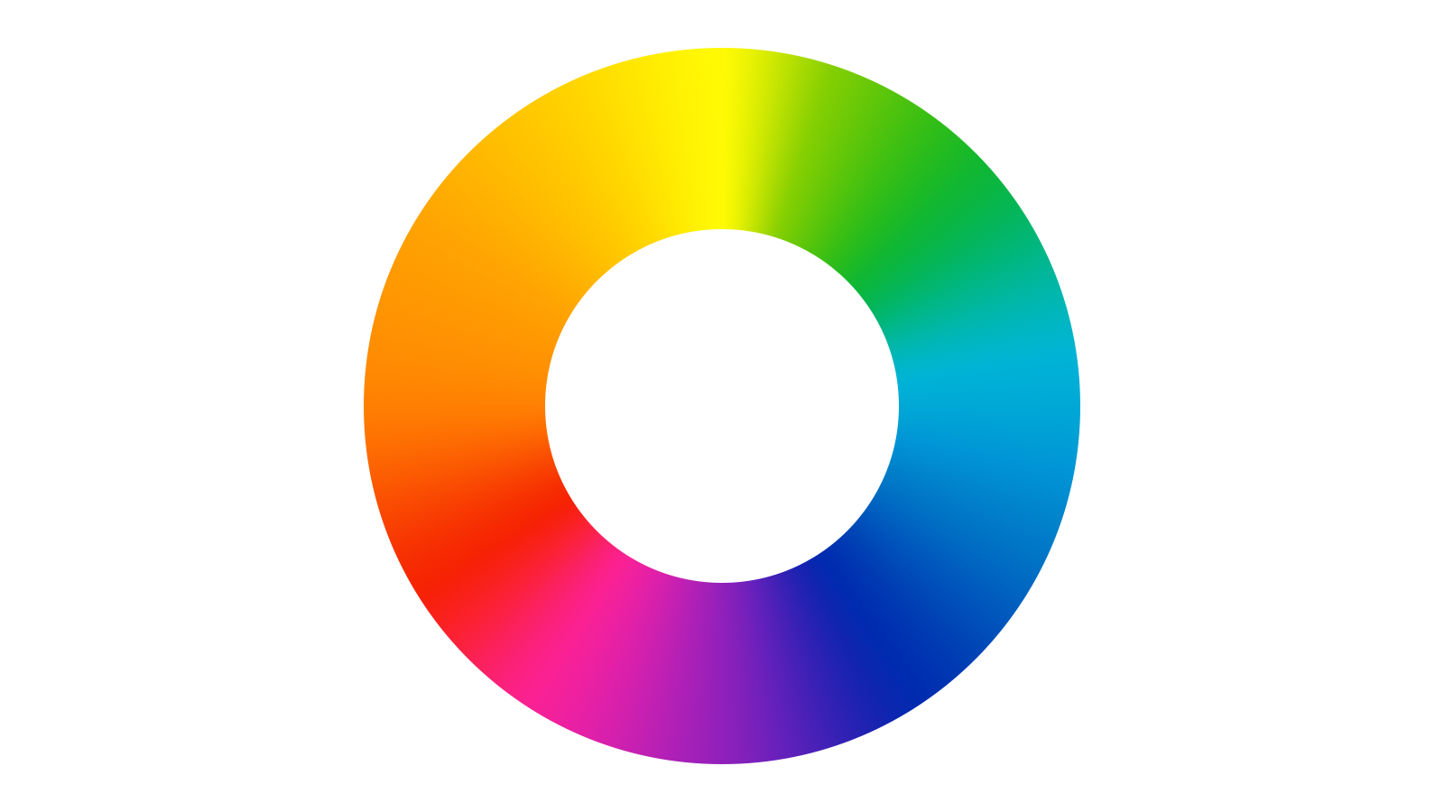
So if the majority of your page is using green, that would be red or purple.
If the majority of your page is using orange or yellow, it might be blue or purple. Or the other way around.
Then increase the size of your buttons by 150% to 200% so they are impossible to miss.
Keep the Design simple instead of beautiful and trendy
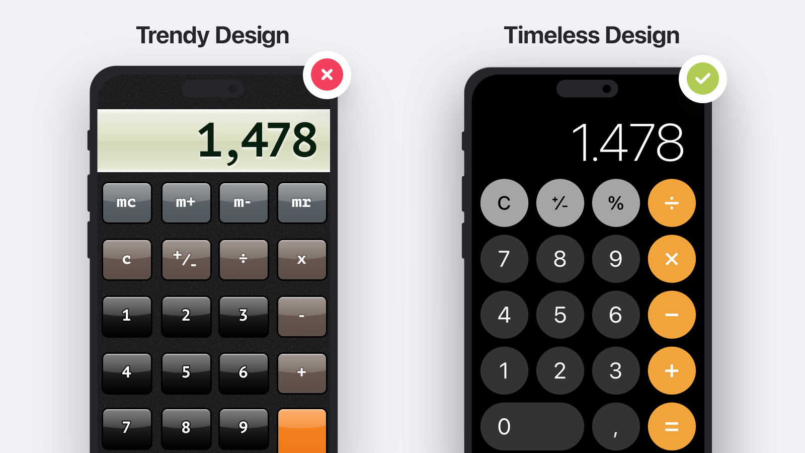
A lot of times website owners and agencies fall into the trap of jumping on the latest design "trend".
The problem is while you do want to continuously optimize your website, so you want it to stand the test of time.
There is nothing worse than having to redo a website every few years because you were following a particular design trend that is no longer popular.
Focus on timeless design instead of trendy design.
Truth to be told that is easier said than done, as even "flat" or "minimalist" designs are a trend in itself. A good rule of thumb is to keep the design simple and avoid too many stylized elements.
Structure
Have a single call to action instead of competing ones
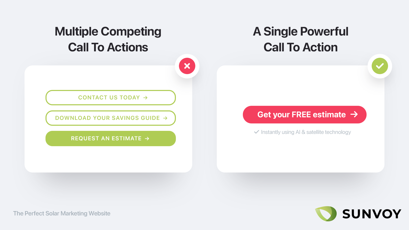
If you only get one thing right, than make sure it's the call to action.
What’s a call to action?
Calling out the desired action you want your visitors to take, such as making a call to your inbound sales team, filling out a form or getting a free estimate.
We all intuitively understand that this matters, yet you won’t believe how may websites get this wrong by either not displaying a clear call to action at all, not using benefit focused language like "Contact us" or mixing up multiple call to actions that compete with each other.
You never want your visitors to wonder about the next action to take. Point it out as clearly as possible.
You are already competing against the back button and the other tabs your visitors have already open, so don’t make it harder for yourself by not giving visitors a clear path to continue.
That’s as well the reason why battle tested pay per click landingpage designer will remove any other navigation items on ad landing pages. This ensures that visitors only can choose between submitting their contact information or abandoning the page.
Every page needs a call to action
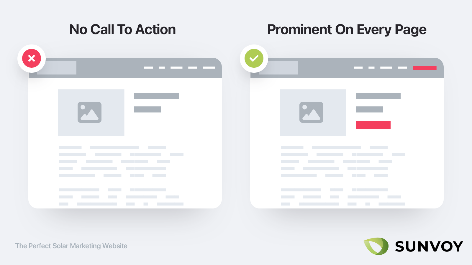
The above is true for your homepage as much as it is for any other page. If a subpage on your website doesn’t has a clear call to action you should consider removing it altogether.
Ideally the call to action of each page is directly connected to making you more revenue like generating inbound leads or referrals.
But even for blog posts visitors are always looking for the next action to take right after reading a post. So ideally right below each blog post you add a powerful call to action that ties back to your solar offering.
Remove every unnecessary form Field
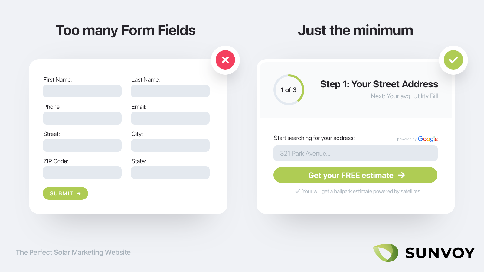
For each form field you add to your optin forms, you can expect the conversion rate to be cut in half (that’s the percentage of visitors that submit the form).
This is a big problem for Solar Installers, as usually there are a handful of key information pieces you require to create an actual estimate.
Make sure that for every form field you ask the question: do I really need it at this point or can I continue without it first.
The number one piece of information you need to collect is the email address. Only this way you can follow up with the prospect.
The second most important piece of information is the phone number. This way you can call the prospect in case they don't get back to you via email.
This doesn't necessarily mean that you should ask for these immediately, as your prospects might be more inclined to provide both if they got something in return first.
If you have a good web developer you should autocomplete city, zip code and state based on the typed in street address, that automatically get's completed as the prospect starts typing.
If you do ask for multiple things make sure to ask for it through a nice flow that guides visitor from one question to the next, getting them slowly invested within the process and less likely to abandon your website.
Put your phone number front and center
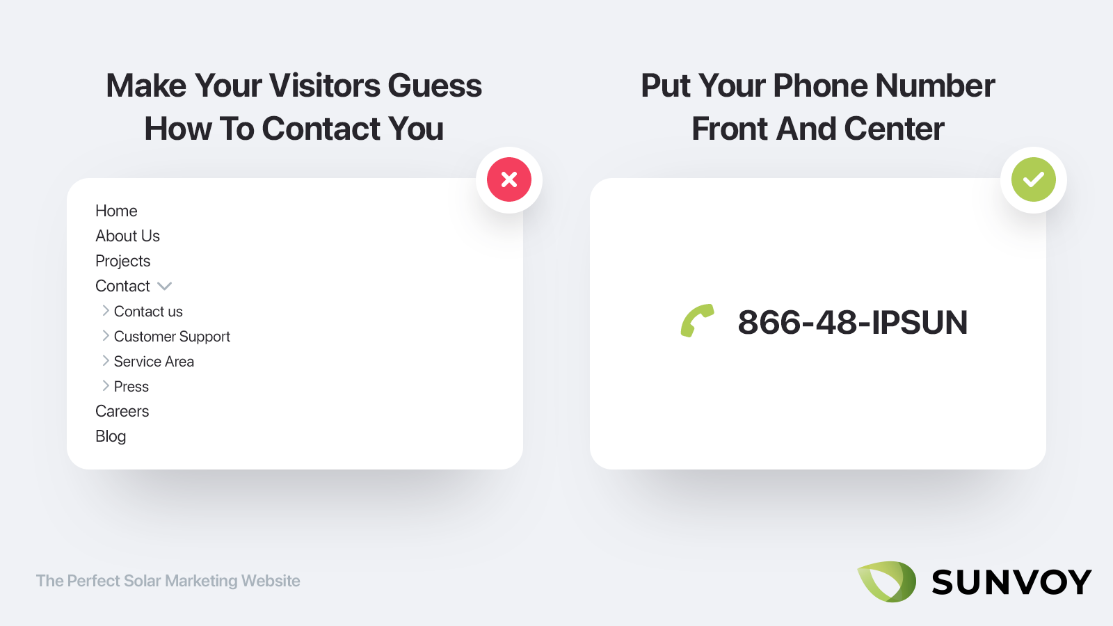
There will always be two type of visitors:
- Those that like to call you
- and those who don’t.
But just because some visitors don't want to call you, doesn't mean that you should hide your phone number. Everybody want's to see it front and center, as it signals trust and that you actually make yourself available to your customers instead of hiding like most companies do.
Don’t hide it.
Put it as clearly visible as possible and make sure to actually link it as a phone number so that people can simply press to call.
Add live chat
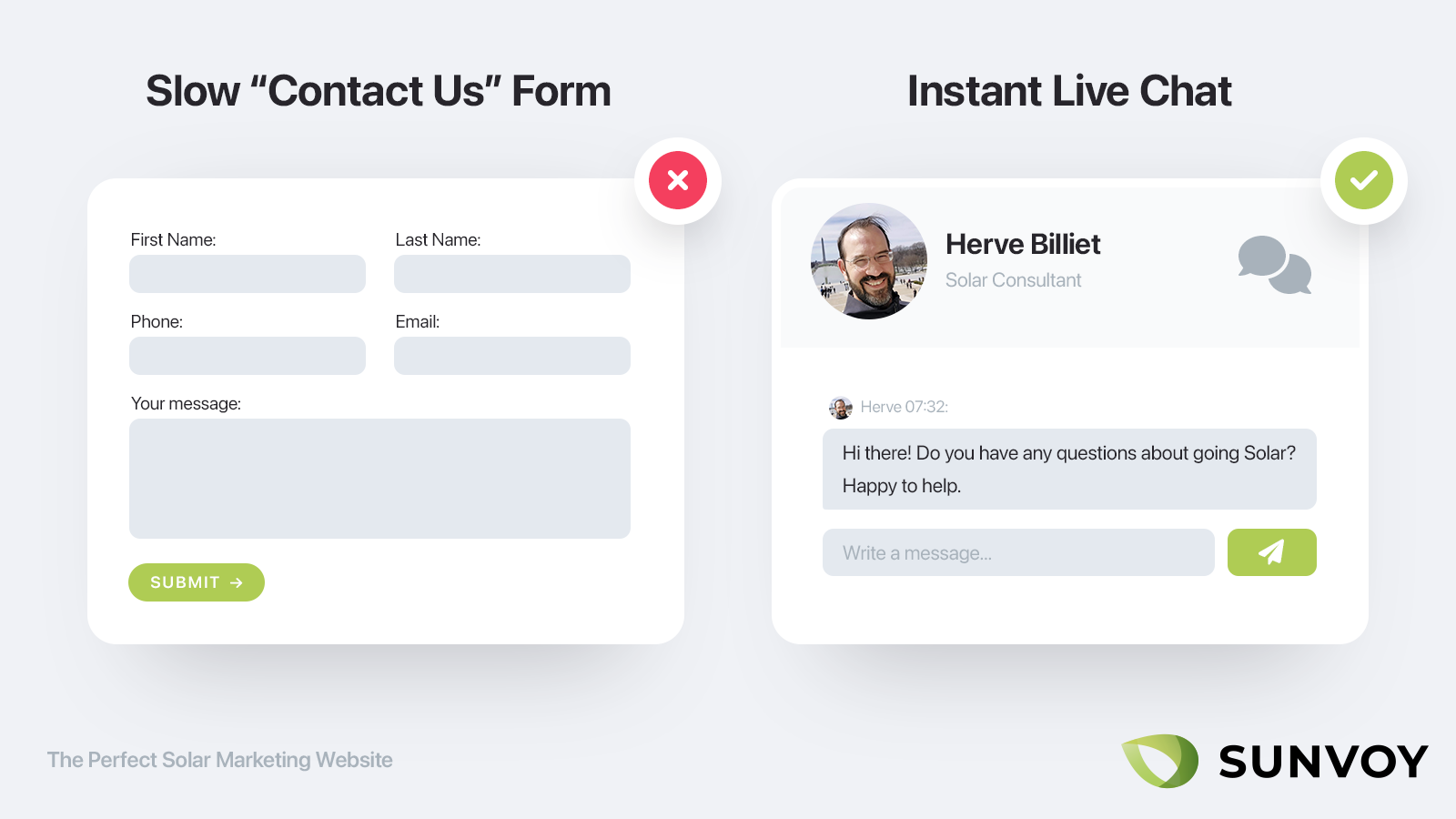
Following the same logic as the phone number you should make it as easy as possible for your potential and actual customers to reach you.
Nobody want's to use a contact form and wait days for a reply.
Having an instant live chat where you can interact with prospects and answer any preliminary questions is an essential part of marketing.
Why?
Because different type of people like to interact with you differently. Some like to call, some like to chat and others like to read and obtain information themselves before getting in touch via email.
Make sure you cater to each preference.
Write a great about page
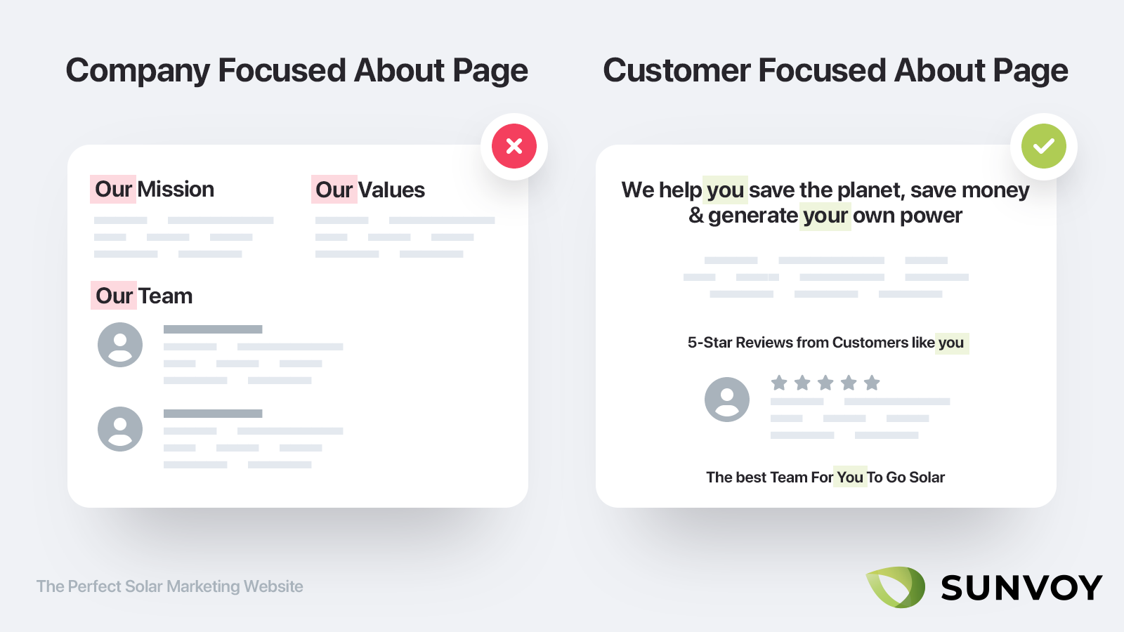
What’s your best guess for the most visited page right after the homepage?
Right: it’s almost always the about page.
Yet most companies throw this opportunity away by self indulging content that presents their team and office pets instead of focusing on what makes you unique to help your customers.
Personality is important, but here is a hard to swallow truth:
Your about page is not about you or your company.
Instead it’s about your prospect and what they want to accomplish. This doesn’t mean you shouldn’t talk about yourself, but only within the context why you are the very best to help solve your customers problems.
Make sure to write as well benefit driven copy that tells the customer why they should care.
Simple example:
Bad: We have been in business for 15 years
Good: You can trust us to deliver your project on time a we have been doing this for over 15 years
Bad: We buy the best quality equipment
Good: You can’t rest assured that you will get the best quality equipment available which we test rigorously before ever using it in customer projects
Even better: words are cheap. Proof is expensive. Throw in customer testimonials that prove your point after each section where you make a bold claim.
Show yourself
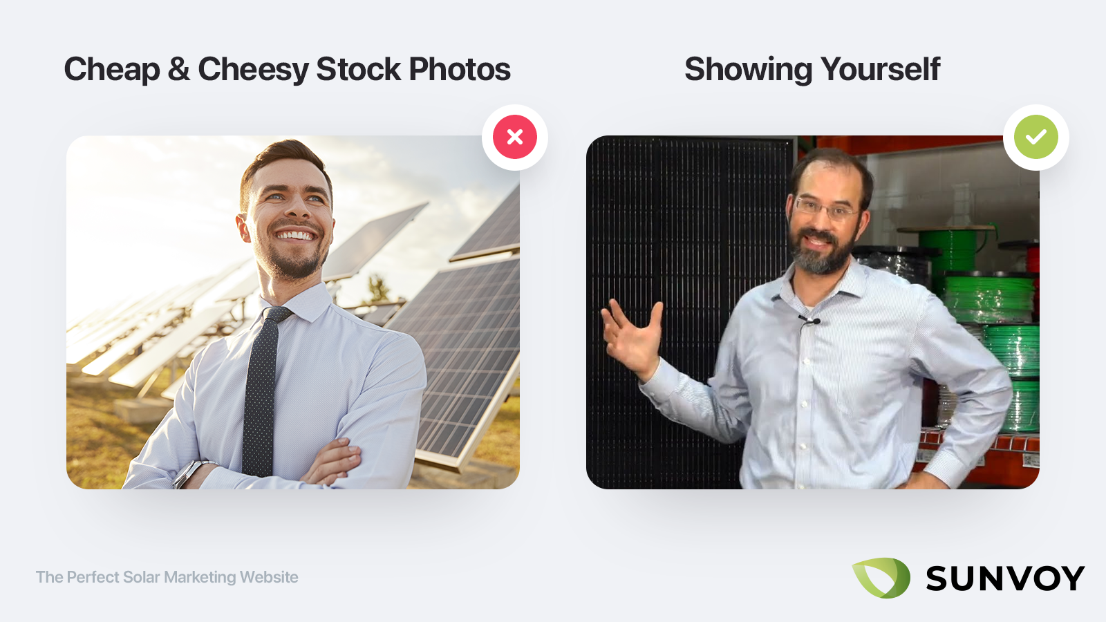
People buy from people. That is true as much for the mom and pop shop as it is for huge enterprise deals or your solar business.
Make sure to show actual faces of you and your team instead of generic and cheap stock photos everybody else is using. Don’t do it just on the about page, but everywhere.
If you have a blog make sure to include author bios, going through the same exercise as on the about page making sure to tell the reader exactly why you are the best possible person to write this particular blog post.
Remove the search bar
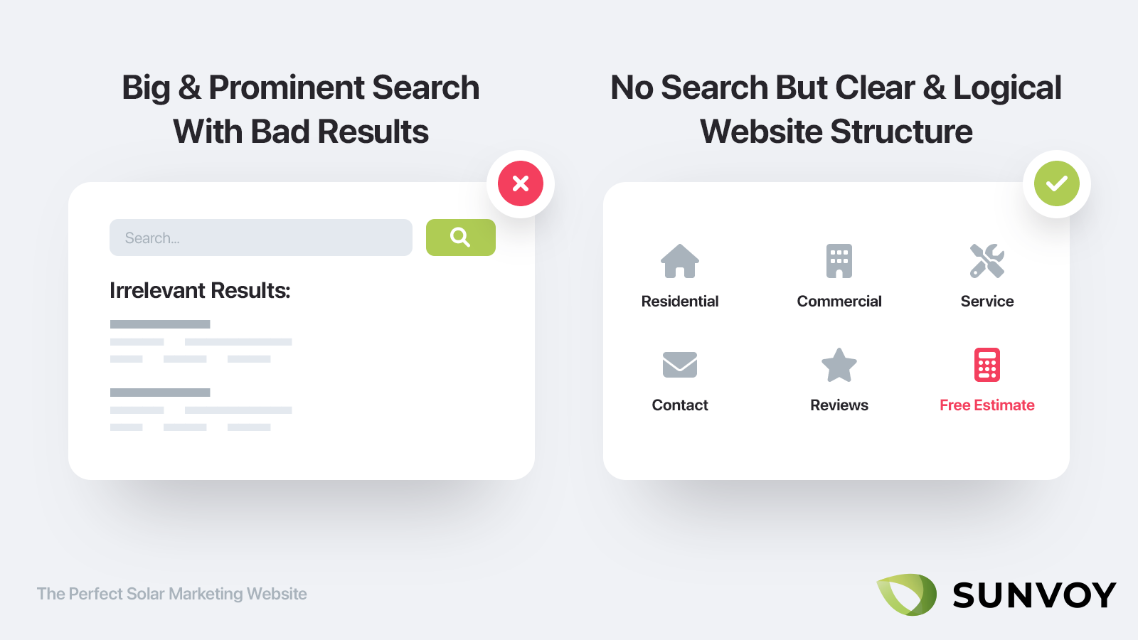
Google has invested billions of dollar in research for providing the best possible search experience and yet you can still often find yourself frustrated with the search results.
Do you really think your website can do better than that?
Search becomes really frustrating if you don’t find what you are looking for. And odds are good that people don’t find what they are looking for if you put a search form on your website.
Instead of the lazy option of adding a search form, try to invest time into making your website structure as clear as possible.
With a clear and logic structure that removes clutter people will easily find what they need. This is something great to get help in, because you might not see the wood for the trees. Ask people outside the solar industry about your website structure and where they would find certain information to double check that it's effective.
If you have a Blog let people discover the content through Google instead of trying to provide a good search experience on your own site.
Make sure your blog is up to date
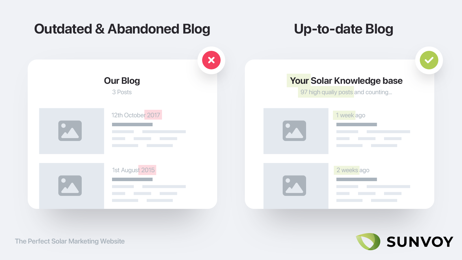
There is nothing worse than visiting a blog from a business where the last post is self serving company news from two years ago.
If you don’t have the resources to staff an active and useful blog, remove it from your website altogether as it will do more harm than good.
If you only very occasional write high quality posts or have just a handful of them that are ranking in google, then simply remove any mention of the publish date or display the "last updated date" instead and make sure to update them regulary with new information.
Own the process
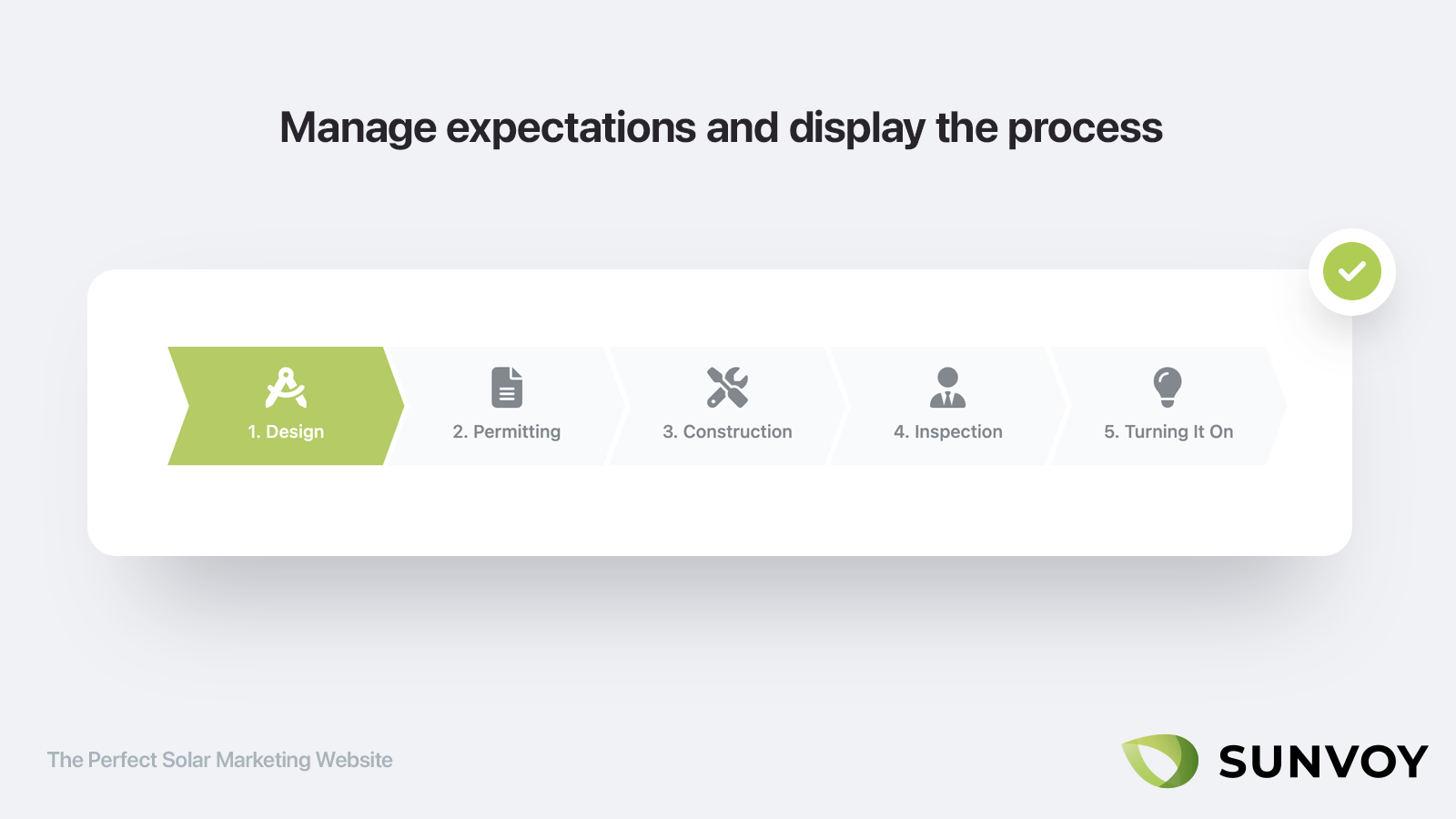
Don’t fall into the trap of over promising and under delivering. Better do it the other way around. We all know that there are things in the process of going Solar that can go not according to plan or delays that are outside your hands.
Be upfront about that and give the visitor a clear expectation of what the process looks like from first contact, to estimate, to contract to finished project. Even better if you have a customer portal in place that expands upon that and takes the customer by the hand as soon as they have signed a contract.
Answer questions
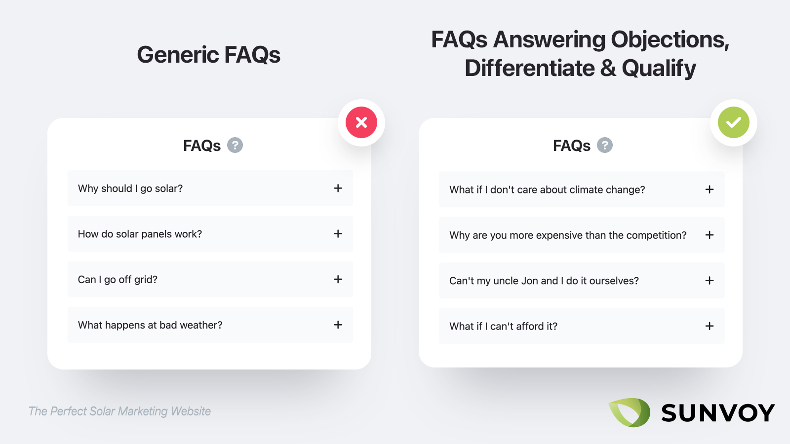
Any sales person will tell you that the best way to counter objections is anticipating and addressing them right away.
Your website should be doing the same. Make sure to have a frequently asked question area. But instead of just including the questions you frequently get (and everybody else is doing) make sure to include as well questions about common objections you get frequently get but maybe people wouldn't ask face to face. For example "why are you more expensive then the competition" is something your pospects might never tell you but think about nevertheless.
Therefore make sure to address even these uncomfortable questions straight on and in the best possible way.
This will even help your solar sales team to answer common objections in a standard way throughout all of your conversations.
Lead Generation
Pick the right Testimonials
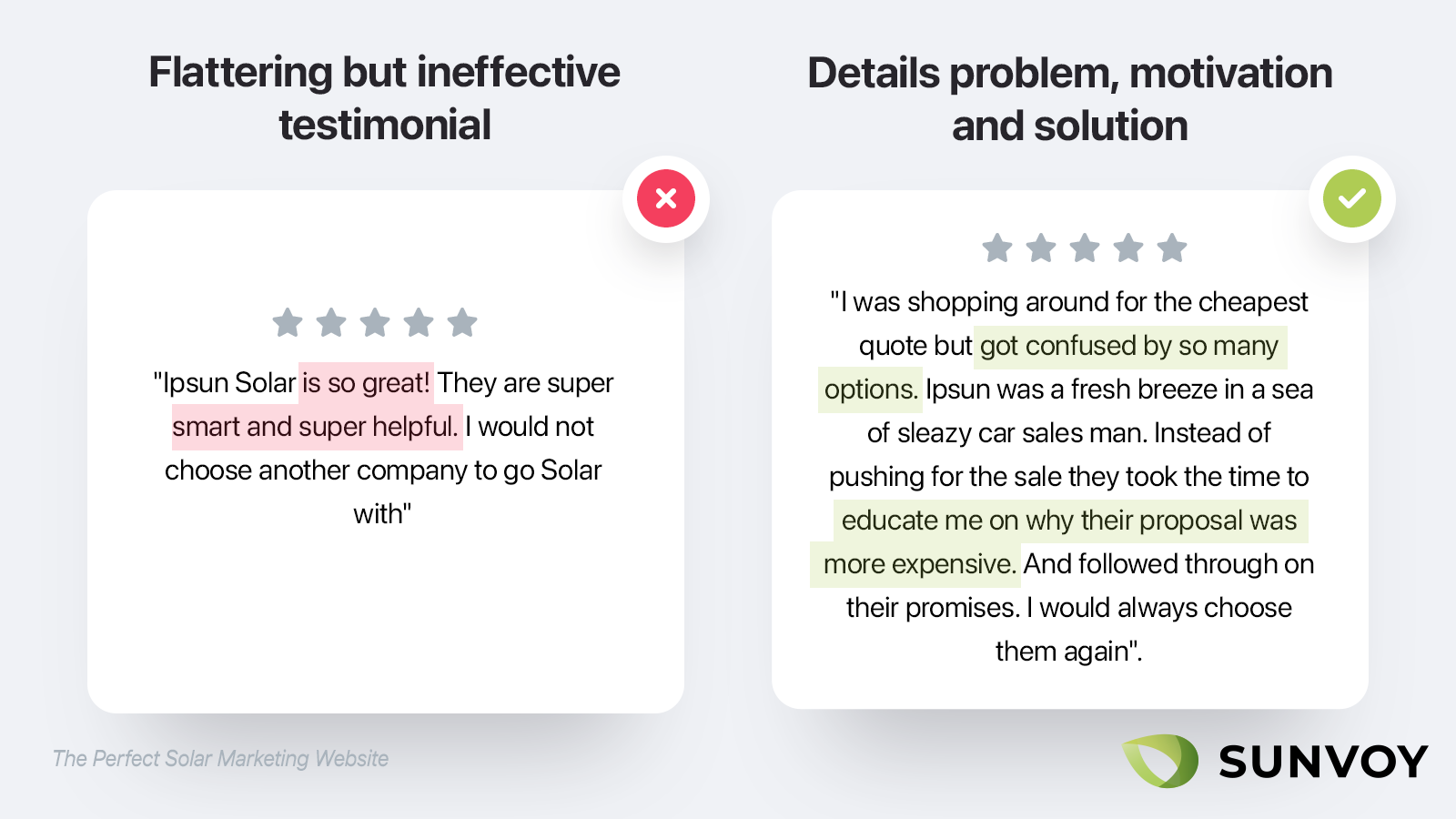
We already mentioned that people by from people. So make sure to add testimonials to your website.
Now most companies already do this.
But they use horrible testimonials.
Read the Following testimonial and judge for yourself:
"Ipsun Solar is so great! They are super smart and super helpful. I would not choose another company to go Solar with"
You might think: What’s bad about this?
Sure, it’s flattering. But it’s super generic and sounds almost borderline fake (even if any business owner will now that every now and then you get real testimonials like this).
Testimonials serve only one purpose:
To show customers that you are the right choice for them.
So ideally they lead with a problem the customer had, show what motivated them (so different customer segments can identify with a testimonial that sounds exactly like them) and shows how you very uniquely positioned to solve it.
This is a way better testimonial to feature:
"I was shopping around for the cheapest quote but got confused by so many options. Ipsun was a fresh breeze in a sea of sleazy car sales man vowing for your attention. Instead of pushing for the close they took the time to educate me why their proposal was more expensive (but well worth the investment). And followed through on their promises, even when some things didn’t go according to plan. They were always proactive in their communication and made sure I was happy even after the install. I would always choose them again".
It's as well better to display three perfect testimonials, one for each of your most important customer segments than to display hundreds of generic and bad ones.
Add Social Proof
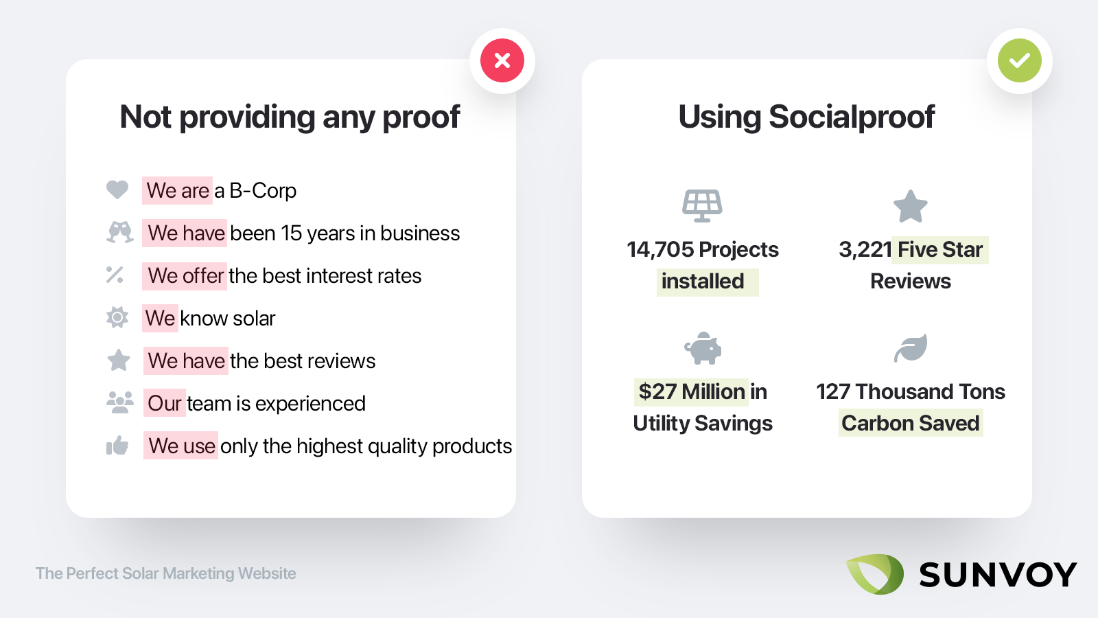
Deep down we are still cavemen. We are wired to look for social proof as it makes it easier to take the right decission. Nobody want's to be the first. That's why restaurants with long lines are more desirable than empty ones.
Social proof shows that you know what you are doing and that you are not just two guys in a truck selling their very first system. Show that others have already trusted in you.
Depending on the stage of your company this can be something simple like:
- total number of years of experience in the solar industry of all of your team members
- total amount of systems installed and customers served
- territories or cities served
- logos of local press mentions
- kWh amount of clean energy produced
- amount of utility payments saved
- total number of 5 star reviews you have received across all of the different portals
Certifications and Industry associations
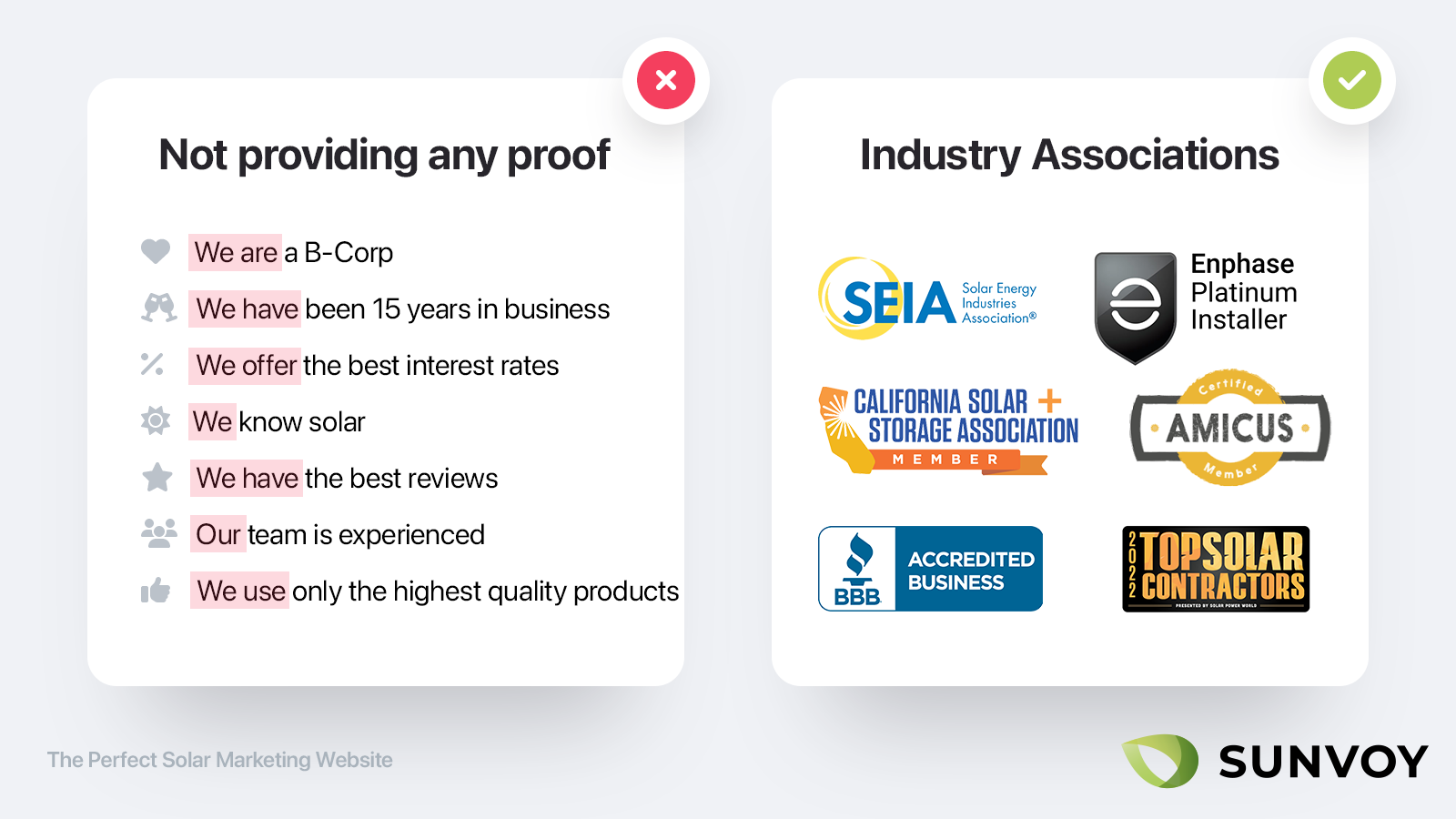
The internet is a vast place. Nowadays anybody can launch a website.
Make sure to signal trust in every possible way.
One of the quickest way to do that is borrowing trust from other well known brands and industry associations.
For example instead of just displaying the number of reviews you have, display the logos of the portals where you got those reviews from.
If you got certifications like NABCEP or are part of an association like California Solar make sure to display their logos prominently as well next to wherever you ask for contact information.
All of these sections should ideally be repeatable on various pages of your website so you can plug them in wherever it makes sense.
Add videos
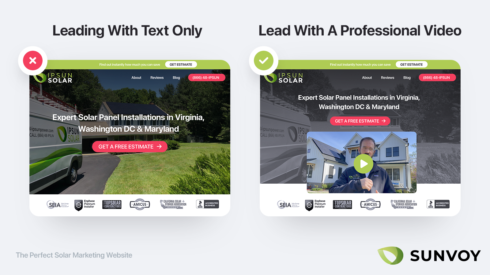
It’s not 1999 anymore. People are incredible sophisticated in browsing the web today.
They decide in a split second if your website is worth a second look or just gets closed immediately.
There is nothing better than earning the trust of your potential customers than using professional produced videos.
Why?
Because everybody knows that they are expensive and hard to impossible to reproduce.
If you can be creative with your use of video:
Don’t just use it for a hero video on your homepage.
But go and record a handful of real customer testimonials in front of their houses proud of their freshly installed solar panels. Record videos of various team members, how they came to your company and what their day to day responsibilities are and why the customer should care about it.
Measure and improve
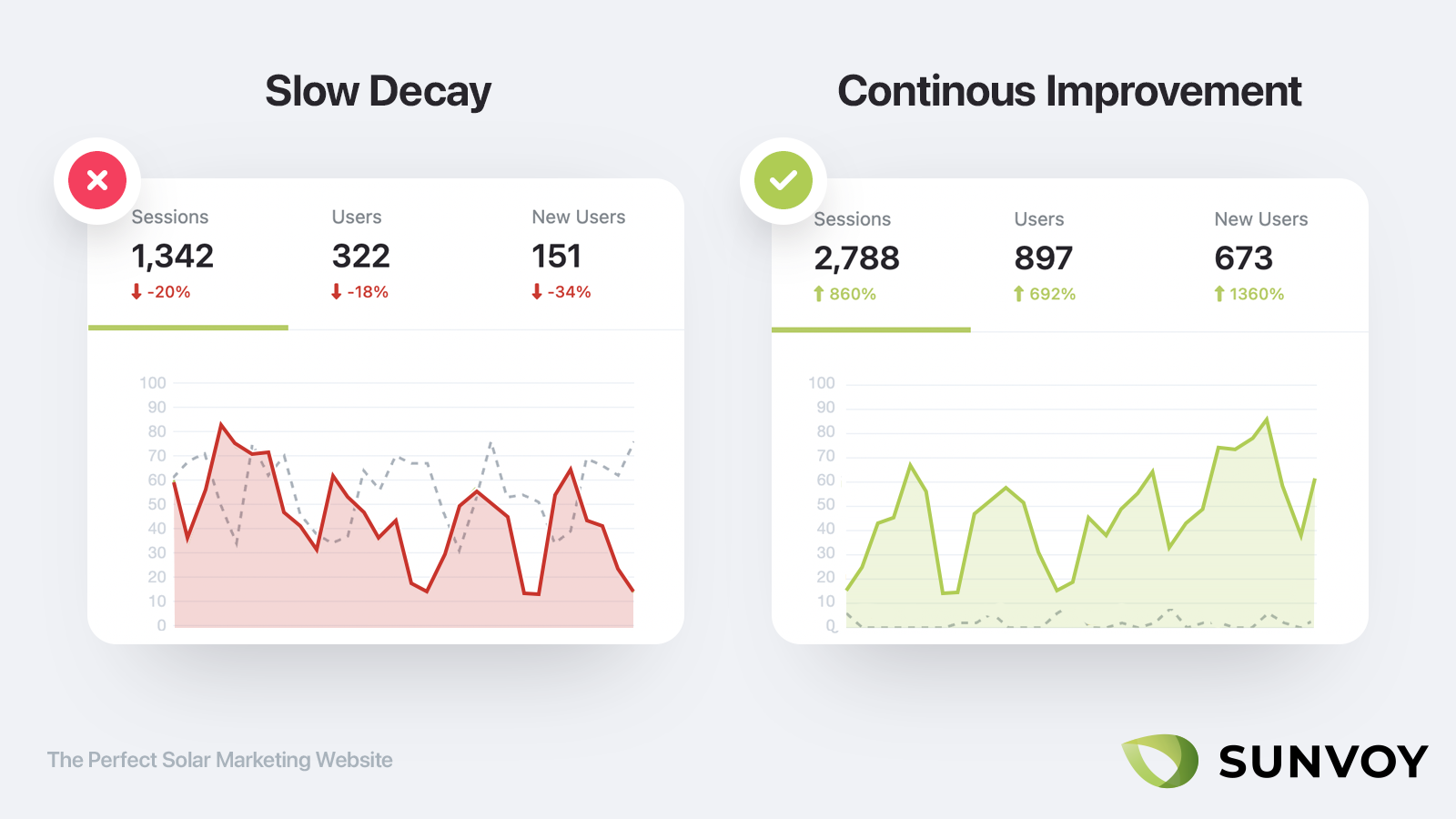
Most companies treat their website as a one off project. But that’s an incredible waste. In the end you don’t know what you don’t know.
At the very least you should have Google Analytics installed and track the number of visitors, leads and customers your website is generating so you can make sure it’s improving over time or take action in case it doesn’t.
But even better if you install a tool such as hotjar that gives you heat maps displaying the most or least clicked elements on your website. This way you can continue to optimize giving important elements a bigger stage and removing things that barely get any attention at all.
You can as well make screen recordings of key pages and see where visitors stall or get sidetracked. There is nothing quite like looking live how people interact with your forms and website.
Then make it a task to review these things once a month with your webdesigner or agency so you can make sure to spot patterns and have a continuous improvement plan in place.
Add an Exit Intent Popup
There is only one exception to the above rule: right before your visitor is about to leave try to offer them one last chance to become a lead. In the end you got nothing to lose: they are about to leave anyway and with 99% of first time visitors disappearing after their first visit it’s doubtful they will return anyway.
An exit intent popup counters that. It shows up right before a visitor indicates through their actions that they are about to leave the page, for example because they are scrolling up rapidly on mobiles or because their mouse leaves the window to type in another website in the browsers address bar.
Make sure again to lead with value and offer a compelling reason why visitors should submit their contact info (ideally only an email) before leaving. Make sure to track whenever the popup gets displayed and don’t display it more than once.
From "aha" to "oh crap", we're sharing everything on our journey to help install 100,000 residential solar systems per year.
We're learning a lot and so will you.
Residential solar systems installed through Sunvoy in the past year:
Real time metrics tracked bysunvoy
Jascha is an award winning top 1% Developer & Marketer. Being the Co-Founder & President of Sunvoy he loves building world-class apps that delight customers & change solar businesses for the better.